A360
WEB EXPERIENCE, AUTODESK
View Site

A360 is an Autodesk cloud and mobile product that allows users to share, collaborate, and view their 3D files.
Challenges
A360 is a simple product, yet many of our users did not have a clear sense of what it is. With the redesign, we wanted to communicate with clarity and authenticity through visual and interactive storytelling.
Some flaws that we identified in the old design:
- Site is not responsive
- Pricing information was hidden
- Inefficient use of white space
- Dated, uninspiring and corporate look
- Abstract imagery did not provide a strong connection to product
Goals
Sign-in & New Account
Signing in or up for a new account should be prominent and quickly accessible on the page
Playfulness & Memorable
Livelier visuals that tell a story, engage and inspire our users
Responsive
The site should adapt to any screen size, allowing users to view on any device
Clarity & Pricing
Help users quickly understand what the product does and pricing is clearly stated
Design Solutions

Sub-navigation
Subnav is persistent at top of page when scrolling. A clear color indicator is added for wayfinding. Sign-in/up buttons also transition into subnav when scrolling for quick access.
Visuals & Isometric Art
Some visual styles from A360 product were used to maintain a consistent visual language. Isometric perspective was used to bring dimension to the art, which is also recognized format used in engineering and architecture.
Color
An overall brighter color palette was applied to make the site feel more fun and inviting. The product brand color was also used more prominently, especially for call-to-actions.
Pricing & Access
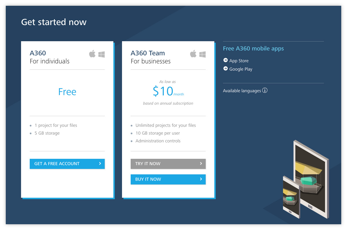
This panel is persistent at the bottom of every page. Pricing is clearly stated and easy to find. Mobile app links are also available for quick access.
Language
Simpler and more direct language was used to clearly communicate product information.

RESPONSIVE DESIGN
The site is adapts to any screen resolution, allowing users to view on any device.
Additional Visual Elements
Informative Video
We also collaborated with Kurzgesagt, a well-known design studio from Germany, to create a playful and entertaining video that helps users understand how A360 works.
The idea was to keep the video short and sweet. The visuals and colors are consistent with the style we used on throughout the site.

Note: Site was redesigned and no longer uses the isometric visuals.
